They say that change is inevitable. An adage that can’t be any truer in brands we have grown to know and support. These changes are influenced by trends, needs, and the urge to appeal to a broader market. In case you haven’t noticed, one of those changes is brand logos. Many notable brands have shifted from using playful logos to a stark, minimalist typeface—Sans Serif.
Over the past few years, we have noticed that many brands, mostly fashion and beauty, opted to use sans serif font to remove the unnecessarily complicated elements of their branding. But many industry experts say that the shift is necessary because of the changing of the season. Like in any industry, brands and companies are now adopting the strategy of targeting a specific market to widen their appeal to their audience.
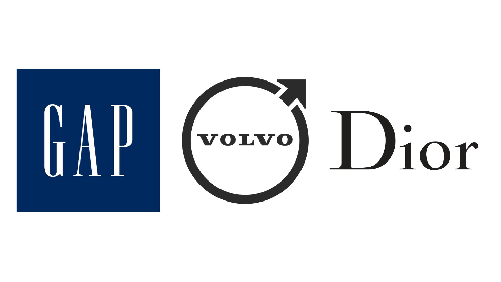
Of course, we know that brands like GAP, Volvo, Jeep, and Dior are some of the first global brands that opted to use the sans serif font. Today, more global brands embrace the wave of sans serif font—joining the bandwagon of the minimalist approach to things to attract younger generations.
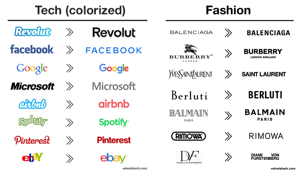
From big tech companies like Google, Facebook, and Microsoft, to fashion brands like Balenciaga, Burberry, and Yves Saint Laurent, it would make you wonder why these brands seem to see something from the Sans Serif font that, maybe, many of us consumers, don’t seem to notice.
Why is Sans Serif working for these brands?
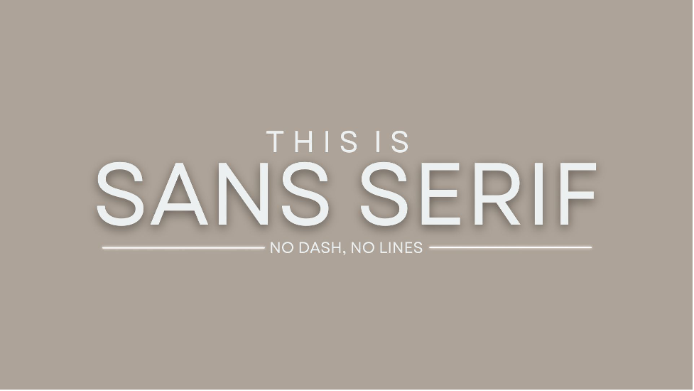
First, how does one even identify a sans serif font? Try to check back to the photos above. Can you spot the similarity? If you noticed that the typeface for new brand logos does not have little dashes at the end of each letter, you have spotted a sans serif font. Another not-so-obvious definition is, well, sans is French for “without.” Serif is a dutch word for “dash,” so sans serif literally means “without a dash/line.”
But why do the sans serif typefaces work for brands, you asked? It boils down to two things, modern utility and simplification. Brands understand that they are no longer just their logos. In order to stand the test of time, they have to adapt to the ever-changing market sentiments, and since predicting what the market would look like in the future is a game of gambles, why not stick to a futuristic representation of your brand, yes?
The sans serif typefaces are not always the right choice or fit for a brand. Like anything else, brands need to understand fully their brand identity and what it represents. Sans serif fonts offer simplicity, legibility, and clarity. In a digital world, central modernist ideals appeal more than peculiarities.